Vue下拉选择框Select组件
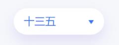
theMuseCatcher 人气:0效果图如下:
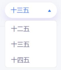
展开图如下:
①创建组件Select.vue:预设两种主题色,亦可视情况进行自定义修改样式:
<template>
  <div class="m-select-wrap">
    <input
      :class="['u-select-input f16', color === 'blue' ? '' : 'white-color']"
      type="text"
      readonly
      @click="openSelect"
      @blur="onBlur"
      v-model="selectName" />
    <div :class="['triangle-down', { 'rotate': rotate }]" @click="openSelect"></div>
    <div :class="['m-options-panel f16', showOptions ? 'show': 'hidden']" :style="`height: ${selectData.length * 40}px;`">
      <p class="u-option" @mousedown="getValue(item.name, item.value, index)" v-for="(item, index) in selectData" :key="index">
        {{ item.name }}
      </p>
    </div>
  </div>
</template>
<script>
export default {
  name: 'Select',
  props: {
    selectData: {
      type: Array,
      default: () => {
        return []
      }
    },
    // eslint-disable-next-line vue/require-prop-types
    selValue: { // 将该prop值作为selV的初始值
      default: undefined
    },
    color: {
      type: String,
      default: () => {
        return 'blue'
      }
    }
  },
  computed: {
    selectName () {
      let selName
      this.selectData.forEach(item => {
        if (item.value === this.selectValue) {
          selName = item.name
        }
      })
      return selName
    },
    selectValue: {
      get () {
        return this.selV
      },
      set (newVal) {
        this.selV = newVal
      }
    }
  },
  data () {
    return {
      selV: this.selValue,
      rotate: false,
      showOptions: false
    }
  },
  methods: {
    openSelect () {
      this.showOptions = !this.showOptions
      this.rotate = !this.rotate
    },
    getValue (name, value, index) {
      this.selectValue = value
      this.$emit('getValue', name, value, index)
    },
    onBlur () {
      this.showOptions = false
      this.rotate = false
    }
  }
}
</script>
<style lang="less" scoped>
.m-select-wrap {
  width: 135px;
  height: 40px;
  line-height: 40px;
  position: relative;
  .u-select-input {
    width: 105px;
    background: #3A79EE;
    color: #FFFFFF;
    box-shadow: 0px 10px 20px 0px rgba(144, 119, 222, 0.2);
    border-radius: 20px;
    height: 40px;
    line-height: 40px;
    padding: 0 15px;
    cursor: pointer;
    border: none;
  }
  .white-color {
    background: #FFFFFF;
    color: #3A79EE;
  }
  .triangle-down { // 下三角样式
    width: 0;
    height: 0;
    border-left: 5px solid transparent;
    border-right: 5px solid transparent;
    border-top: 10px solid #333;
    position: absolute;
    top: 18px;
    right: 15px;
    transition: transform 0.3s ease-in-out;
  }
  .rotate {
    transform: rotate(180deg);
  }
  .m-options-panel {
    position: absolute;
    background: #FFFFFF;
    border-radius: 8px;
    width: 133px;
    border: 1px solid #E3E3E3;
    top: 46px;
    left: 0;
    color: #706F94;
    .u-option {
      padding: 0 15px;
      cursor: pointer;
    }
    .u-option:hover {
      color: #3A79EE;
      background: #EEF1FA;
    }
  }
  .show {
    display: block;
  }
  .hidden {
    display: none;
  }
}
</style>
②在要使用的页面引入:
<Select
    :selectData="selectData"
    :selValue="selValue"
    color="white"
    @getValue="getValue" />
import Select from '@/components/Select'
components: {
    Select
}
data () {
    return {
        selectData: [
        {
            name: '十一五',
            value: 11
        },
        {
            name: '十二五',
            value: 12
        },
        {
            name: '十三五',
            value: 13
        },

        ],
        selValue: ''
     }
}
created () {
    // 初始化下拉框
    this.selValue = this.selectData[0].value
}
methods: {
    getValue (name, value, index) {
          console.log('item:', name, value, index)
    }
}
加载全部内容