CSS3使用过度动画和缓动效果 CSS3使用过度动画和缓动效果案例讲解
qq_44935762 人气:0想了解CSS3使用过度动画和缓动效果案例讲解的相关内容吗,qq_44935762在本文为您仔细讲解CSS3使用过度动画和缓动效果的相关知识和一些Code实例,欢迎阅读和指正,我们先划重点:CSS3过度动画,CSS3过度缓冲效果,下面大家一起来学习吧。
transition过渡:
四个小属性
| 属性 | 意义 |
|---|---|
| transition-property | 哪些属性要过渡 |
| transition-duration | 动画时间 |
| transition-timing-function | 动画变化曲线(缓动效果) |
| transition-delay | 延迟时间 |
- transition过度属性是CSS3浓墨重彩的特性,过度可以为一个元素在不同样式之间变化自动添加“补间动画”

- 兼容性IE10开始兼容,移动端兼容良好
- 曾几何时,网页上的动画特效基本都是由JavaScript定时器实现的,现在逐步改为使用CSS3过度
- 优点:动画更细腻,内存开销小
- transition属性有4个要素:
transition:width 1s linear 0s;(什么属性要过度、动画时长、变化速度曲线、延迟时间)
<!DOCTYPE html>
<html lang="en">
<head>
    <meta charset="UTF-8">
    <meta http-equiv="X-UA-Compatible" content="IE=edge">
    <meta name="viewport" content="width=device-width, initial-scale=1.0">
    <title>动画过渡</title>
    <style>
        .box {
            width: 200px;
            height: 200px;
            background-color: black;
            transition: width 5s linear 0s;
        }
        .box:hover {
            width: 500px;
        }
    </style>
</head>
<body>
    <div class="box">

    </div>
</body>
</html>
就是需要过渡的的加属性值transition,第一个值为变化的属性
哪些属性可以参与过渡
- 所有数值类型的属性,都可以参与过渡,比如width、height、left、top、border-radius
- 背景颜色和文字颜色都可以被过渡
- 所有变形(包括2D和3D)都可以被过渡
all:
- 所有的属性都要参与过渡,可以写all
transition:all 5s linear 0s;
<!DOCTYPE html>
<html lang="en">
<head>
    <meta charset="UTF-8">
    <meta http-equiv="X-UA-Compatible" content="IE=edge">
    <meta name="viewport" content="width=device-width, initial-scale=1.0">
    <title>动画过渡</title>
    <style>
        .box {
            width: 200px;
            height: 200px;
            background-color: black;
            transition: width 5s linear 0s;
        }
        .box:hover {
            width: 500px;
        }

        .box1{
            width: 200px;
            height: 200px;
            background-color: blue;
            transition: all 5s linear 0s;
        }
        .box1:hover {
            width: 400px;
            height: 200px;
            background-color: greenyellow;
            border-radius: 50%;
        }
    </style>
</head>
<body>
    <div class="box"></div>
    <div class="box1"></div>
</body>
</html>
过渡的缓动效果:
缓动参数
- transition的第三个参数就是缓动参数,也就是变化速度曲线
transition:width 1s linear 0s;
常用的缓动参数
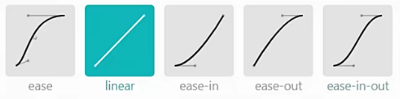
子属性
transition-timing-function:ease;
<!DOCTYPE html>
<html lang="en">
<head>
    <meta charset="UTF-8">
    <meta http-equiv="X-UA-Compatible" content="IE=edge">
    <meta name="viewport" content="width=device-width, initial-scale=1.0">
    <title>动画过渡</title>
    <style>
        * {
            margin: 0;
            padding: 0;
        }
        .box1 {
            border:1px solid black;
        }
        .box1 p{
            width: 50px;
            height: 50px;
            background-color: blue;
            position: relative;
            left: 0;
            margin-bottom: 10px;
            transition: left 5s linear 0s;
        }
        .box1 p:nth-child(2) {
            transition-timing-function: ease;
        }
        .box1 p:nth-child(3) {
            transition-timing-function: ease-in;
        }
        .box1 p:nth-child(4) {
            transition-timing-function: ease-out;
        }
        .box1 p:nth-child(5) {
            transition-timing-function: ease-in-out;
        }
        .box1:hover p {
            left: 100px;

        }
    </style>
</head>
<body>
    <div class="box1">
        <p></p>
        <p></p>
        <p></p>
        <p></p>
        <p></p>
    </div>
</body>
</html>
贝塞尔曲线:
- 网站https://cubic-bezier.com/可以生成贝塞尔曲线,可以自定义动画缓动参数

加载全部内容