Python绘制子图及刻度变换 Python 实现绘制子图及子图刻度的变换等问题
l8947943 人气:0想了解Python 实现绘制子图及子图刻度的变换等问题的相关内容吗,l8947943在本文为您仔细讲解Python绘制子图及刻度变换的相关知识和一些Code实例,欢迎阅读和指正,我们先划重点:Python,绘制子图,子图刻度变换,下面大家一起来学习吧。
1、涉及到图的对比会用到子图形式展示,先看看效果

2、绘制代码如下
accuracy_alexnet_clef = [78.05, 78.43, 78.65, 78.61, 78.69]
accuracy_resnet_clef  = [84.56, 84.84, 85.07, 85.01, 85.13]
accuracy_alexnet_office10 = [87.30, 87.57, 87.78, 87.72, 87.50]
accuracy_resnet_office10  = [96.31, 96.35, 96.62, 96.43, 96.15]
orders = ['2', '3', '5', '10', '20']
names = ['alexnet', 'resnet']
# 创建两幅子图
f, ax = plt.subplots(2,1,figsize=(6, 8))
# 第一根柱子偏移坐标
x = [i for i in range(len(orders))]
# 第二根柱子偏移坐标
x1 = [i + 0.35 for i in range(len(orders))]
# 两幅子图之间的间距
plt.subplots_adjust(wspace =0, hspace =0.4)
# 选择第一幅图
figure_1 = ax[0]
# 设置x轴偏移和标签
figure_1.set_xticks([i+0.15 for i in x])
figure_1.set_xticklabels(orders)
# 设置y轴的范围
figure_1.set_ylim(bottom=77,top=86)
# 绘制柱状图,x表示x轴内容,accuracy_alexnet_clef表示y轴的内容,alpha表示透明度,width表示柱子宽度
# label表示图列
figure_1.bar(x, accuracy_alexnet_clef, alpha=0.7, width = 0.35, facecolor = '#4c72b0', label='Alexnet')
figure_1.bar(x1, accuracy_resnet_clef, alpha=0.7, width = 0.35, facecolor = '#dd8452', label='Resnet')
figure_1.set_ylabel('Accuracy%') # 设置y轴的标签
figure_1.set_xlabel('Order') # 设置x轴的名称
figure_1.set_title('Alexnet') # 设置图一标题名称
figure_1.legend() # 显示图一的图例
# 选择第二幅图
figure_2 = ax[1]
figure_1.set_xticks([i+0.15 for i in x])
figure_1.set_xticklabels(orders)
figure_2.set_ylim(bottom=77,top=100)
figure_2.bar(x, accuracy_alexnet_office10,alpha=0.7,width = 0.35,facecolor = '#c44e52', label='Alexnet')
figure_2.bar(x1, accuracy_resnet_office10,alpha=0.7,width = 0.35,facecolor = '#5f9e6e', label='Alexnet')
# figure_2.bar(orders, accuracy_resnet_clef,alpha=0.7,width = 0.35,facecolor = '#dd8452')
figure_2.set_ylabel('Accuracy%')
figure_2.set_xlabel('Order')
figure_2.set_title('Resnet')
figure_2.legend()
f.suptitle('ImageCLEF_DA') # 设置总标题
plt.show()
补充:解决python中subplot绘制子图时子图坐标轴标签以及标题重叠的问题
1.问题描述
在使用python的matplotlib中的subplot绘制子图时出现信息相互重叠的情况。
2.解决方案
在plt.show()前面添加代码plt.tight_layout()即可解决。
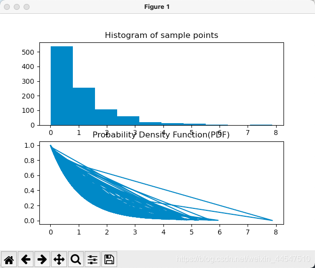
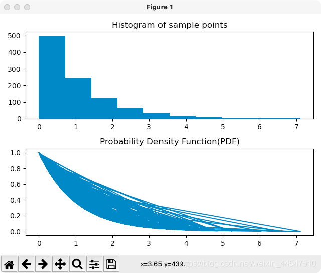
plt.subplot(211)
plt.figure(1)
plt.hist(x, 10)
plt.title("Histogram of sample points")
plt.subplot(212)
plt.plot(x,X.pdf(x))
plt.title("Probability Density Function(PDF)")
plt.tight_layout()
plt.show()
以上为个人经验,希望能给大家一个参考,也希望大家多多支持。
加载全部内容